Logos & Branding | Brick.
Company
Brick is a real estate and property management startup based out of Utah. I joined the company in its early stages and worked with the founders to build a brand, design software and experiences and craft strategy for the product and it's development. This included several pivots as we worked to find our place in the crowded prop-tech market.
Deliverables:
- Graphic Design
- Brand Guide
- Logo
- Brand Composition
- Brand Imagery
- Collateral Mockups
My Roles:
- Visual Designer
- Graphic Designer
Specifications:
Tools: Figma, Adobe Illustrator, Affinity Designer

Overview
We spent just a little time fleshing out a logo and some colors early on as a startup but wanted to avoid going too deep into the branding and logo development until we had settled as company and had a better idea of what our product offerings looked like and how we wanted to present ourselves; what story we wanted to tell.
Design Process
Research & Explore
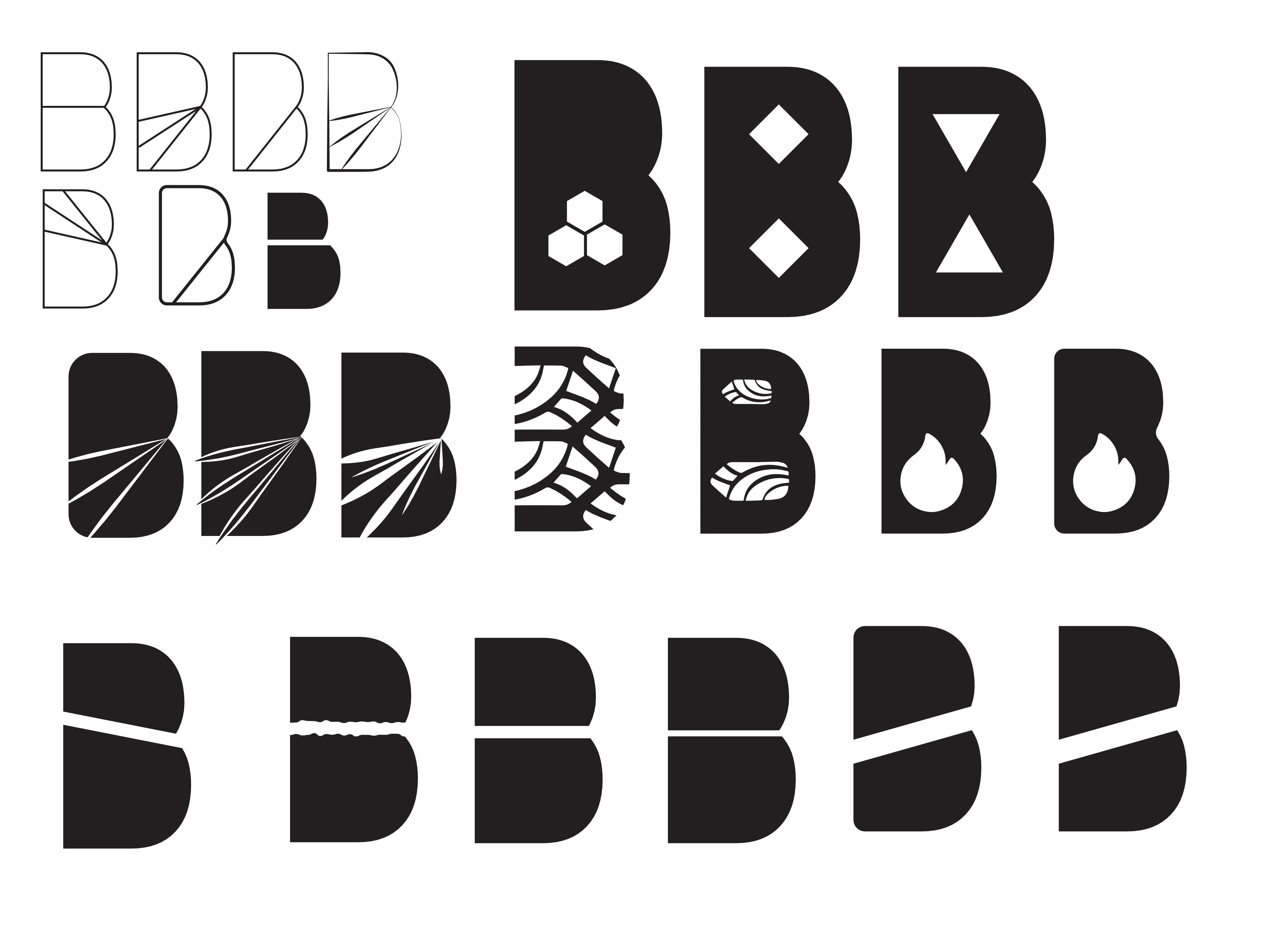
The original logos and word marks were simple sans-serif designs that were functional but did not provide anything unique or special about the company or what the brand could become.
Findings
- One of the core issues with branding and design that we wanted to cover was the expansion of our product offerings under the umbrella of “Brick.” This included things like:
- Brick Equity - A product for improving access to home equity lines of credit.
- Brick Marketplace - A Zillow-like experience for off-market real estate contracts.
- Brick Kiln - Our proprietary property management and CRM software and potential SAAS product.
- Brick Offer - Our customer facing portal experience for selling property to Brick.
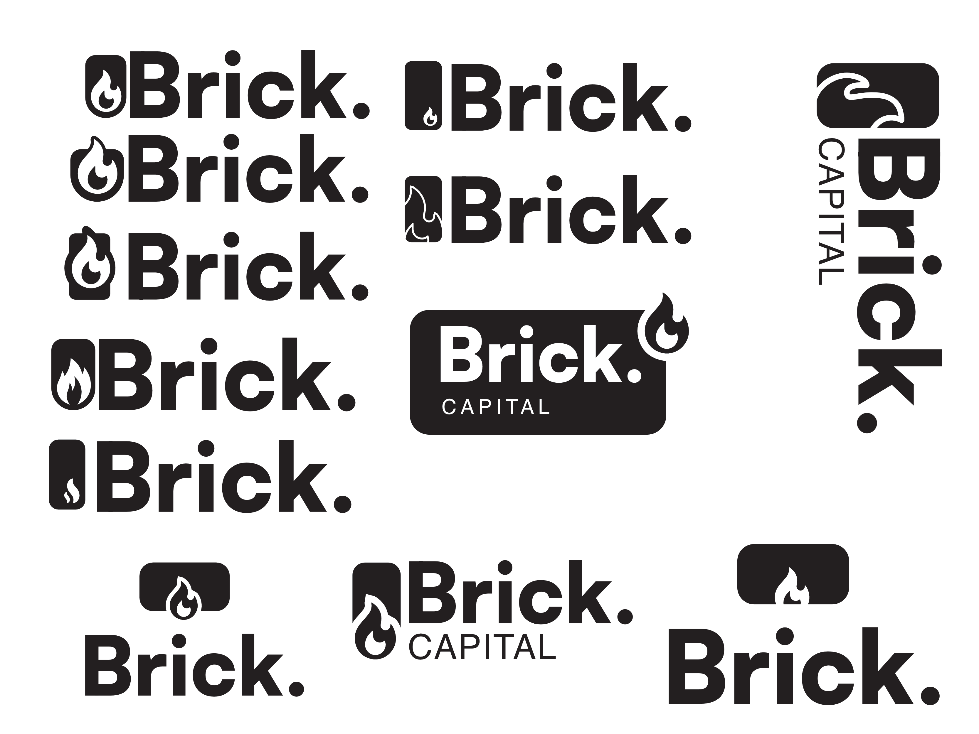
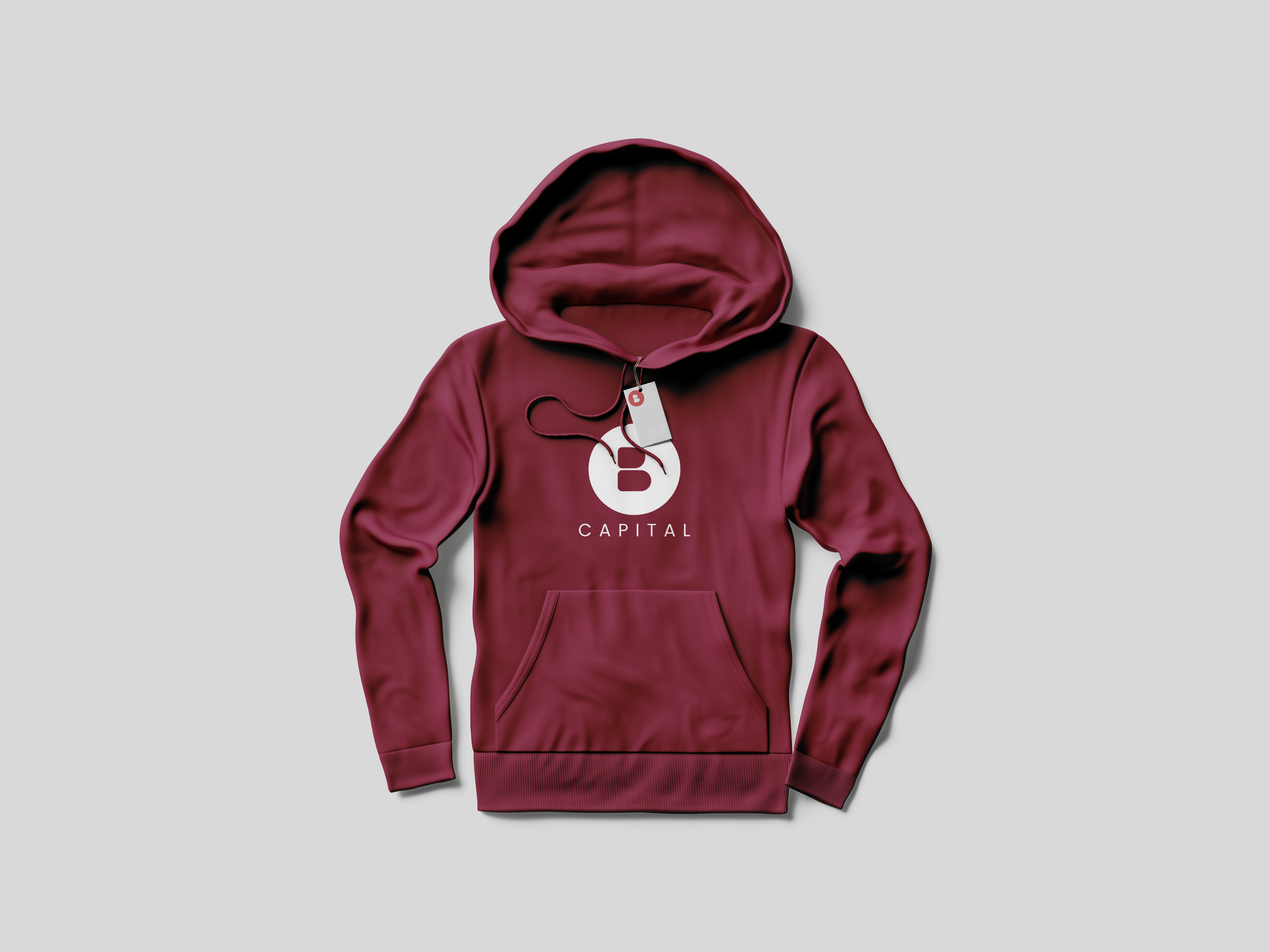
- Brick Capital - Real estate investment resource.
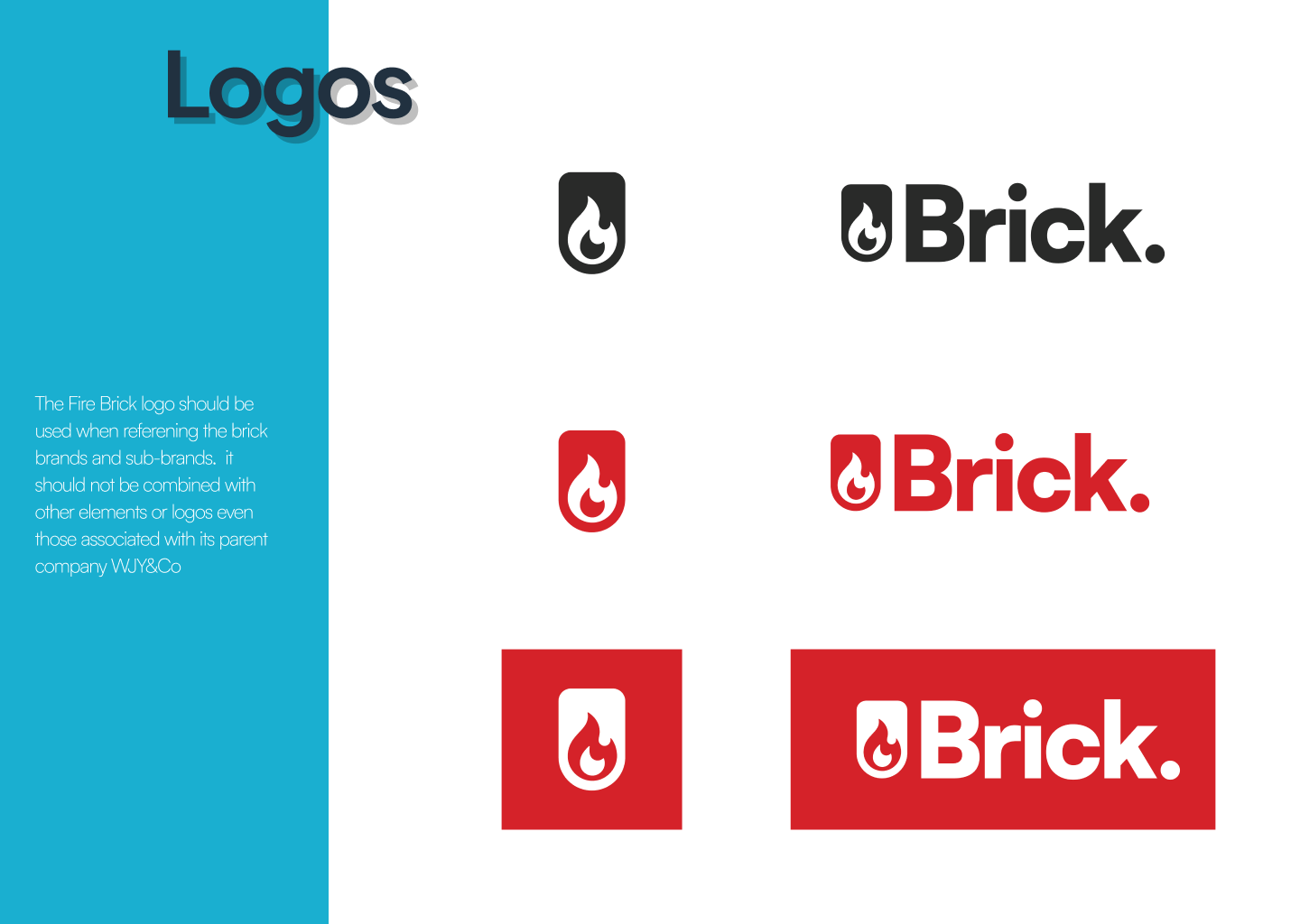
- We also knew that we wanted a singular logo that could be placed on any of our products and immediately be recognized as being a piece of the greater whole.
- We realized that we would need additional logos and branding that would have to maintain a similar design language to allow for differentiation without losing the core brand.
Refine and Analyze
Decisions
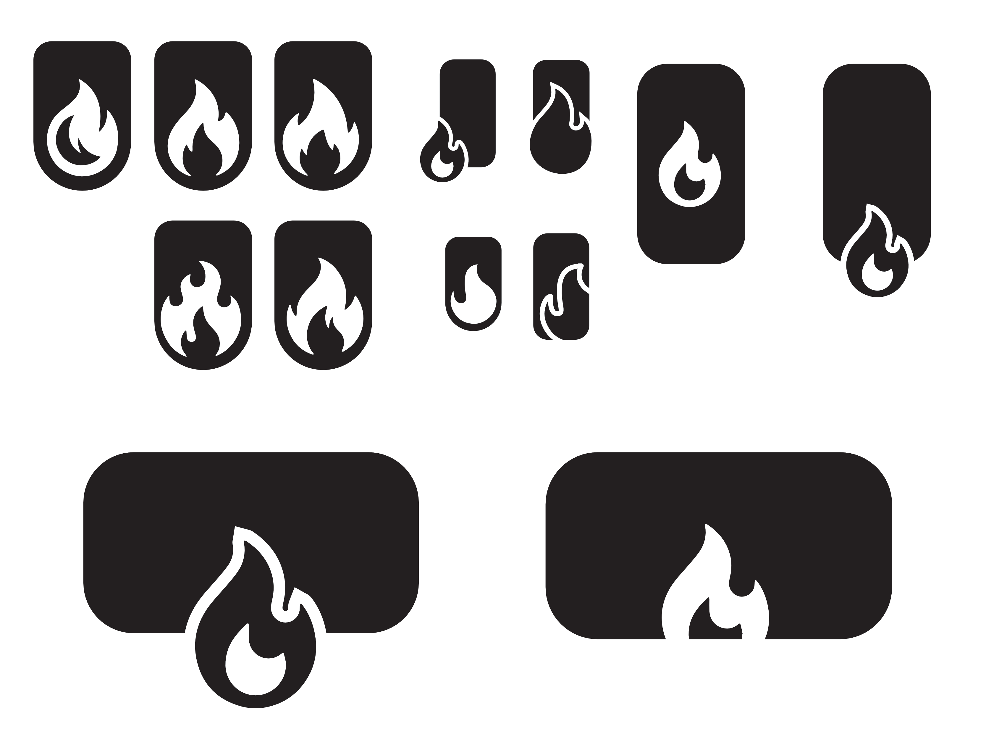
- Move away from a letter based logo.
- Work around the square-ish shape of a normal brick.
- Lean into energy and excitement aspects of bricks or brickwork
- Fire, Heat, Sturdy, Beautiful
- Steer clear of construction related iconography and inspiration
- no trowels, mortar, stacks of bricks, buckets etc.
Final Designs
Iterate & Refine
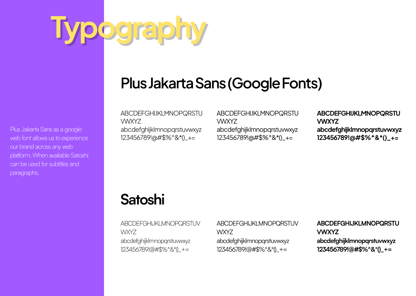
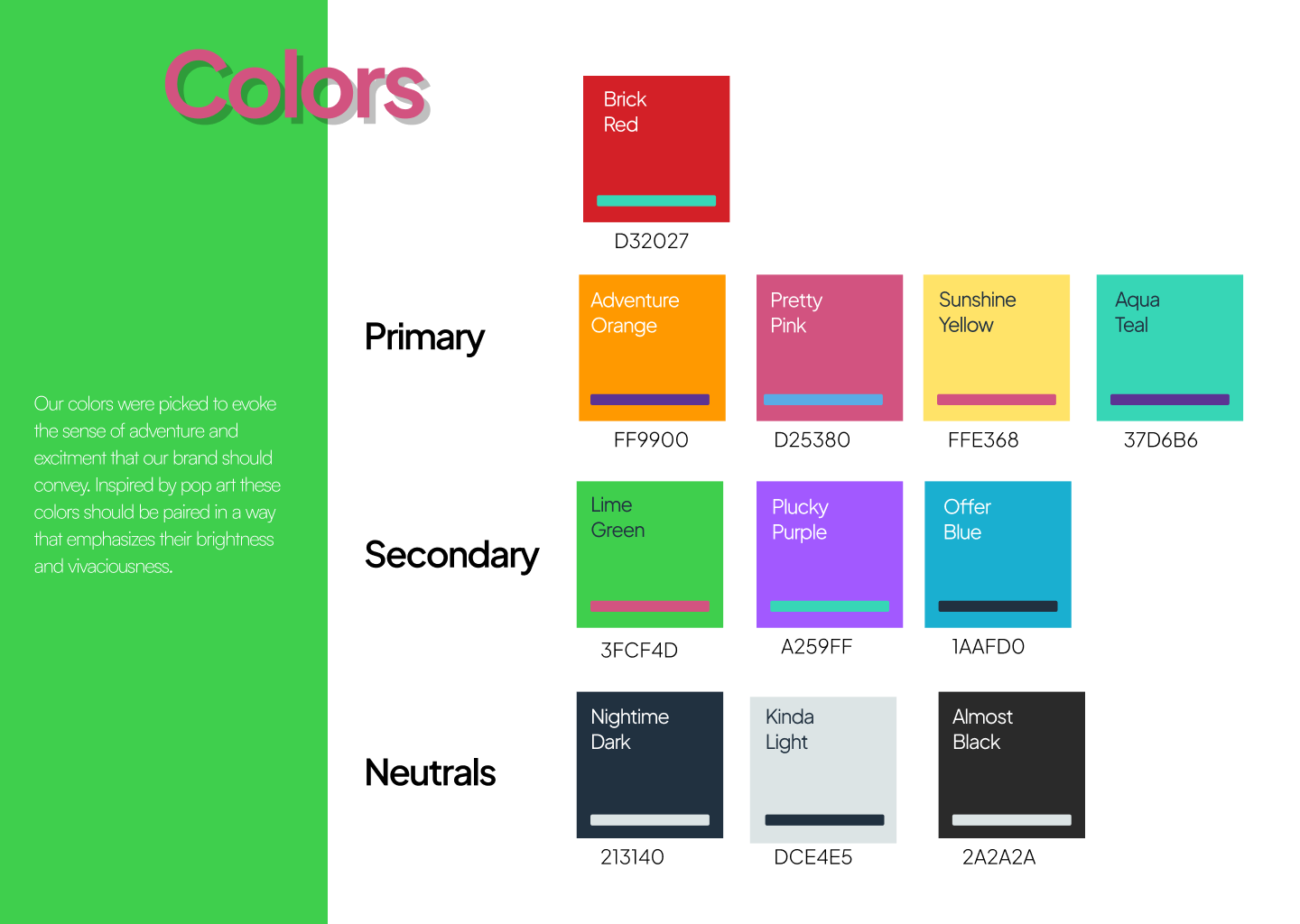
We spent some time updating our offerings with the new logo, colors and typography and use that as the basis for informing how we wanted the brand to evolve and the feelings we wanted to evoke.
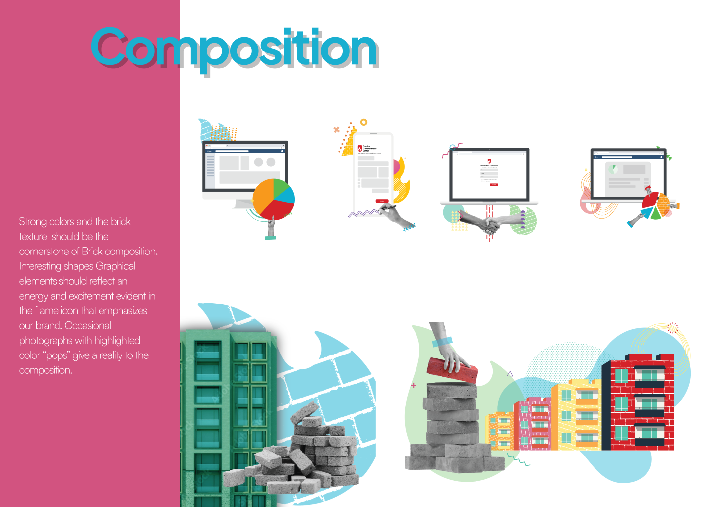
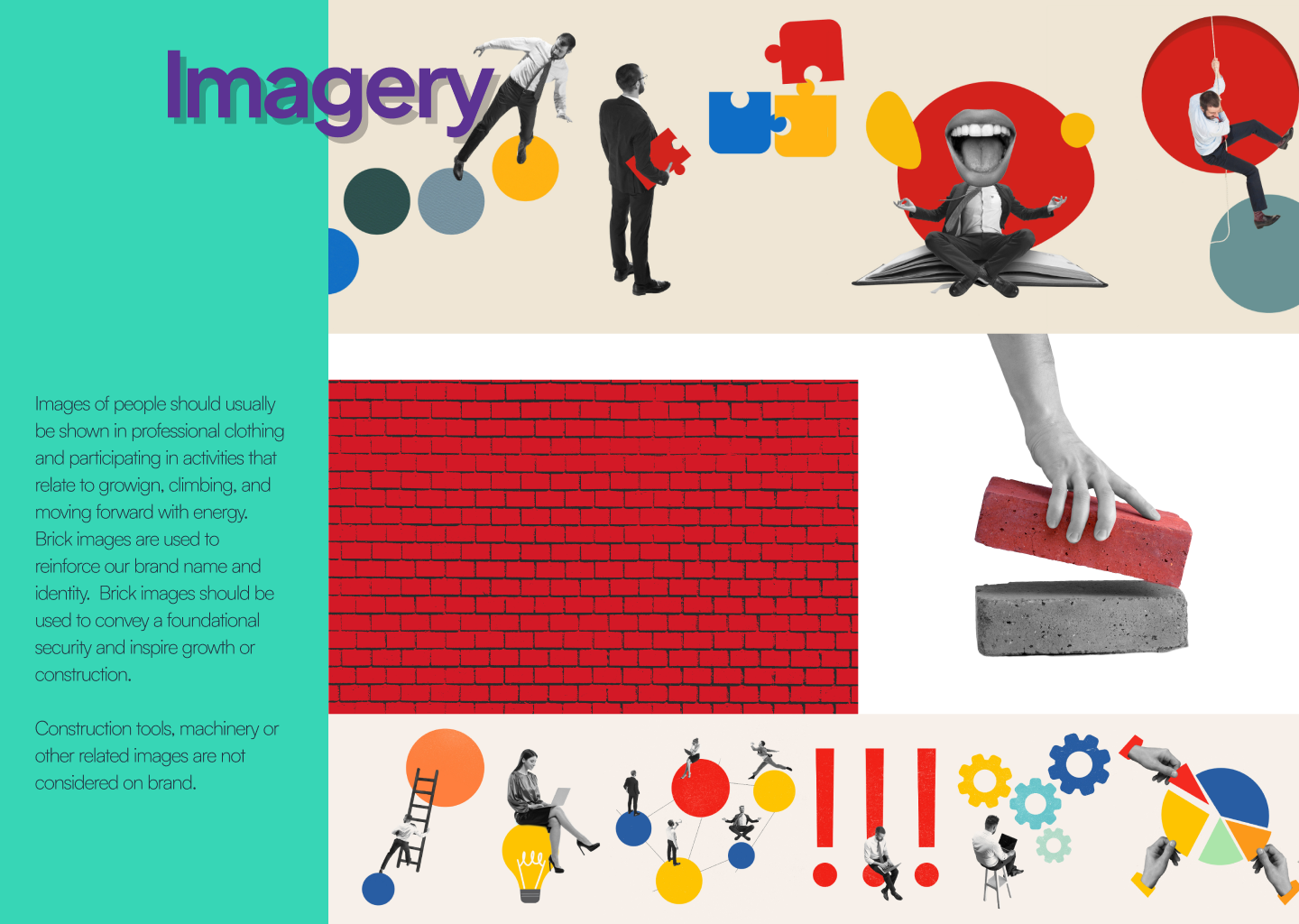
This led us into developing the composition and Imagery sections of the Brand guide. Strong colors evoked our company values and the proposition of direct clear information about property and real estate. offset by black and white professionalism that allows the colors to stand out.
Visual elements in the composition space create patterns and shapes that can be reused in a variety of situations and mediums.
After building out much of the brand guide we were finally able to revisit the products and brands that would be a part of the Brick family. The time we spent developign the initual designs allowed us to quickly iterate and build out icons and wordmarks for the rest of the suite of products and companies.
Lessons Learned/Final Thoughts
One of the recurring themes through this design project was remembering that as much as we try to craft a system and visuals that we think present the brand we want to build, at the end of the day it is so much more than just our design that impacts how consumers and other business view the company and its products.
.png)
.png)
.png)
